The Top Is In… for now
Or: Calling It, If Only It Weren’t for that Darned QE.
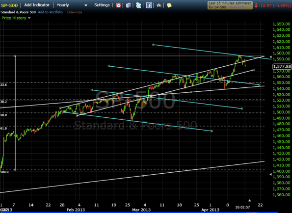
The S&P index peaked on April 11th, 2013, at $1597.35. Interestingly enough, the current resistance level represents the third equidistant descending trend line that runs parallel to the descending trend line of the megaphone pattern (lines shown in light blue):
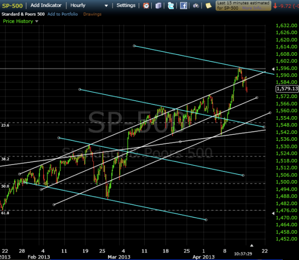
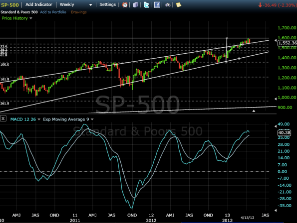
As I predicted on March 6th, we tested the $1576 level, couldn’t break it, so pulled back, then retested $1576, broke it and charged up to test the $1600 level, but could not break through. This doesn’t mean, however, that the longer term uptrend has been broken and we may still test the $1600 level again. However, we’ll see some consolidation as we trade lower in the next few days, testing the upwardly sloping parallel trendlines. At worst, we may test $1550, where there is strong support.
I do think, though at the risk of sounding bearish, that we are at, or very close to, a medium term top.
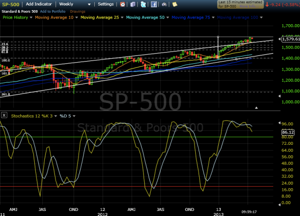
A look at the Stochastic levels would indicate that we’re overbought on the weekly time frame. Additionally, we’re way up above our 25- and 50-day moving averages, which would suggest we’re due for a consolidation back to these levels of support.
However.
We can throw out whatever we think we know about the market trends when the Fed continues to purchase assets at the rate of around $80 billion dollars per month. Quantitative easing might throw a wrench in my bearish outlook (Honestly, I’m really not a permabear, I’m actually a very optimistic person – I just trust my current math). It is no secret that the stock market clearly likes it when the Fed announces rounds of quantitative easing as evidenced here and here.
But what I’m most curious about are these trend lines. What are the slopes and are the slopes important?
Looking at a single date, the differences between the upwardly sloping trend lines (in white) are approximately $18, or ~1.1%. That is, if we were to take the price of the trend line on April 1st, it would be $1572. The next white trend line on April 1st is at $1553, and the next is at $1536.
Additionally, the slope of the white trend lines is ~1.9%/month. That is, the level it was on April 1st was 1.9% higher than the level it was on March 1st, which was 1.9% higher than that was on February 1st.
The descending light blue trend lines paint a similar picture. Between each successive trend line there is a difference of about $44, or around 2.9%. And the slope is ~0.8%/month (interestingly, half of the upward trend line).
I can’t come up with a rational explanation for these trend lines, but I’ll be happy to hear any thoughts from my readers. My best guess is that it has to do with the average GDP growth rate, and that the markets are trying to move in step with the economy.
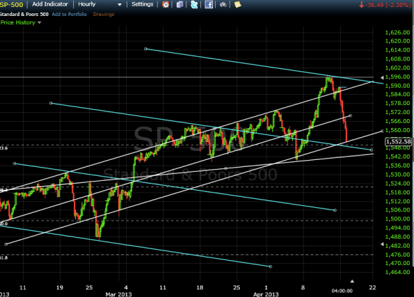
End of day update:
Sure looks like a top. We’ll certainly see some support at $1550, but beyond that, the 2nd light blue trend line has to hold, or else we’ll head lower.
Stepping back to a longer time frame, the weekly indicators (MACD, Stochastics) certainly look overbought.
If we were to draw Fibonacci levels from the low of November 2012, a move back to $1450 would be a 61.8% retracement. Because we’ve moved up so high so fast, a retracement to $1450 and a bounce off the lower upward trend line of the converging triangle would still allow the longer-term uptrend to be intact.
Just some of my thoughts while we thank our lucky stars that we have our health and we have people around us that love us.
