The Activation Energy of Innovation
Or: The Difference Between Tech and Biotech.
Recently, Yahoo agreed to acquire Summly for $30 million, the product that resulted in apparently 18 months of time for 17-year old Nick D’Aloisio.
A few months ago, This Week in Startups episode #333 featured Jim Louderback, CEO of Revision3. He described how he sold Revision3 for around $35 million to the Discovery Channel, a modest outcome for notable investors Greylock Partners, Marc Andreessen, and Mark Cuban, but a positive outcome nonetheless as they had chipped in only $10 million.
You don’t see this happening in biotech. You don’t really see biotech companies coming out of parents’ basements or people’s garages. This only happens in tech because the barrier for entry is so low. Have access to a computer, then just learn to code (can be done for free online) and you can start a business with real, actual revenue. Heck, you don’t even need a college degree and you can become a billionaire, just look at Zuckerberg, Jobs, and Gates. Paypal co-founder Peter Thiel is even giving kids $100k not to get a degree.
Thanks to many decades of technological innovations from pioneers such as Fairchild Semiconductor, Intel, Tandem, Cisco, and Apple, the barrier of entry for embarking on an entrepreneurial career in tech today and ultimately achieving a successful exit has been lowered.
There are also a number of tech startup incubators, such as 500 Startups, Techstars, Founder Institute, and Y Combinator, that see a few of their graduate companies obtain “small” exits in the $10 to $30 million range. Obviously no Facebooks, yet, but certainly minting millionaires or near-millionaires.
For biotech? See Arr Oh of the Just Like Cooking blog has a great post wondering where all the under-40 biotech billionaires are. First, you need a solid educational foundation in chemistry and biology. This takes about a decade of your life. Assuming you’re not burnt out from the 4 years of poor college student life, the ~5 years of just-barely livable $20k/yr grad student stipend working 80 hour weeks, and the 1-3 years of a $40k/yr academic postdoc, perhaps you still have that fiery, entrepreneurial spirit and are willing to embark on the high risk endeavor of a startup.
Second, consider that the average cost to bring one innovative, life-saving drug to market is estimated to be between $4 billion and $11 billion when you consider previous R&D failures, according to an excellent article written by insightful Forbes contributor Matthew Herper (highly recommend a follow #FF). Biotech is a cash burn business that requires extensive capital to even just get an idea into the clinic. There are the costs of lab space, reagents, chemical and biohazard waste disposal, personnel, and instrumentation.
Clinical trials themselves are expensive as there is the manufacture of enough product to dose all your patients, the documentation of data points and compliance, and of course the overhead of paying your employees. And if your drug fails in clinical trials? Welp, would have been quicker to just take your $100 million and burn it.
Recently Sanofi had to halt development of Iniparib, a cancer treatment drug candidate, after it failed late-stage trials. Sanofi must now deal with a $285 million charge and nothing to show for that cash.
Because of the extensive capital investment required to achieve success in biotech, the exit multiples for life science VCs are suppressed. Take for example the recent acquisition of Omthera (OMTH) by AstraZeneca (AZN) for up to $443 million. Omthera’s lone asset, Epanova, is a combination of omega-3 fatty acids (ELA and DHA) and currently in Phase III trials for the treatment of hypertriglyceridemia. Omthera had reportedly raised $140 million prior to the sale, so VC backers Sofinnova Capital and New Enterprise Associates, having held onto their shares through the IPO, saw ~5x and ~2.5x, respectively, for their investment.
With a deal potentially valued at around half a billion dollars, it’s certainly a win for the investors and founding team. However, because Omthera was required to raise over $100 million, the multiple on invested capital wasn’t as high as it could have been. If the capital investment required to see a biotech company to a successful exit could be lowered, the exits would see much better multiples allowing for more cash to be infused in the startup ecosystem enabling even more innovations.
Allow me to invoke the Curtin-Hammet Principle.
The Curtin-Hammett Principle states that if a reaction has two rapidly interconverting intermediates that each go to a different product, the ratio of the products will depend on the transition state energies (ΔG1‡ and ΔG2‡), not the ground state energies of the intermediates. The product ratio is therefore controlled by the difference in free energy (ΔΔG‡) of the transition states of both intermediates, even though the intermediate and major product may be thermodynamically less stable. In other words, the reaction will proceed through the path of least resistance potentially affording a less-stable product than the path of most resistance.

The Curtin-Hammett Principle Energy Diagram
If we apply the Curtin-Hammett Principle to the startup world, the result would be something like the above diagram. We start from one of the middle two wells: founding a ‘Tech Startup’ or a ‘Biotech Startup’ (our interconverting intermediates). We then move outward to the left or to the right toward realizing the ‘Tech Innovation’ or the ‘Biotech Innovation’, respectively. However, we must overcome the activation energy (ΔG1‡ or ΔG2‡), which is the capital investment required to realize a successful innovation.
I argue that the difference in capital investment required between a tech and biotech innovation (ΔΔG‡) pushes both entrepreneurs and investors towards the left since it’s much easier to achieve some semblance of success in tech, despite it being less beneficial to society in the broadest sense.
The above diagram has many implications. One is that we need cheaper ways of doing science. Science is darn expensive; from the reagents, to the equipment, to brain-power, to clinical trials, the costs are astronomical. Lowering the barrier would enable more innovations to reach the populace, which would have an immense benefit for society, including lowered healthcare costs and more lives saved.
The second, non-obvious implication is that our bright, young minds are being steered by lucrative careers into the low-barrier-of-entry computer science fields of developing dating/picture-sharing apps and away from the core sciences. Of course it’s nice to have an app that’ll give me 10 places to eat, but I question the broader benefit to society. Now, I’m not here to debate the apparent “shortage of STEM workers”, because there is no shortage for those of us in the “S” fields of chemistry, biology, etc. In fact, there’s a glut. What I would like to see, however, is a scientifically literate society, and it would help to not scare away bright, young minds from contributing to scientific innovations because the costs of achieving success are so high.
When the barrier is lowered, you enable anyone with a great idea and a will to execute it to contribute to the body of knowledge. The low barrier also augments the exit multiple allowing for better exits and more cash infusion for sustaining the startup ecosystem.
I am therefore bullish on any technology that effectively lowers the activation barrier for biotech innovation. This includes robotics that enable high throughput screens, genetic screens that identify patients most likely to benefit from a clinical trial, and models that can predict liver toxicity of drugs in development.
I am most intrigued about SeaChange Pharmaceuticals. Based on a computational approach as described in high-impact papers, SeaChange seeks to predict drug side effects and uncover new uses for existing drugs.
I believe that right now biotech is where tech was in the 90s, web 1.0. Since the early days of Fairchild, Cisco, and Apple, high capacity data storage has gotten cheaper, internet speeds have skyrocketed, and cloud computing is a reality. These advances, and others, have enabled the tech boom of the past decade, and now that we are in web 2.0, the barrier has never been lower.
The biotech sector has been on a tear this year as the Nasdaq Biotech Index Fund (IBB) and Market Vectors Biotech ETF (BBH) are up around 30% for the year to date. And there have been a number of hot biotech IPOs so far this year. But as technology drives down the costs of bringing a biotech product to market, it will soon become biotech2+.
The S&P 500 is Now 1000 Points Up from March ’09 Lows
Or: “…These Go to Eleven“.

S&P 500, Weekly chart, freestockcharts.com
We are currently sitting at $1666.29, which is about 1000 points above the March 2009 low of $666.79. Contrary to my previous forecast, we blew through the $1600 level on a positive jobs report and rose rapidly to our current level. All is well and $1700 is the next target, right? Right?
As of May 19th, 90% of publicly traded companies have reported 2013 Q1 earnings. Of those companies, the FactSet earnings insight report details that 70% have reported earnings above the mean estimate and 47% have reported revenue above the mean estimate, while the blended earnings growth rate was 3.2%. I highly recommend taking a moment to read that FactSet report. I’ll link to it again because there’s some great data in there.
Let’s take a moment to look more closely at these numbers.
Google, Comcast, Wal-Mart, and a number of other large-cap companies, reported profits that beat expectations, while their revenues missed. What is one way a company can miss on revenue, but still beat on the bottom line? That’s right, they can cut their expenses. What is a company’s biggest expense? Payroll.
Furthermore, I am not convinced that the jobs data is detailing a true picture of the job market. One of the criteria accounted for in the unemployment rate is whether or not one is actively seeking work. A falling unemployment rate could indicate that, as a group, fewer people are actively looking for work and therefore it would seem on the surface that there is a smaller pool of applicants causing the rate to fall artificially.
The up-shot of this is that Wall Street and Main Street have essentially been de-coupled. I don’t think it can be accurate to say that since we’re hitting all time highs in the major stock indices, that our economy is all well and good and everything is peachy.
Companies have been getting more efficient and the markets are certainly rewarding that efficiency as we hit all time high after all time high. The question is at what cost to the broader economy. If this is the new normal efficiency level, it might be difficult to say we will return to pre-2008 employment levels.
I know I’m getting macro here, but I think it’s important to understand the economic climate prior to investing (or trading) any one company’s stock. It can be difficult to swim against the prevailing long-term trends, so I try to react, or anticipate, accordingly.
So where do we head from here? All the technicals would indicate that we’re overbought. A Fibonacci retracement from March ’09 low of $666 to $1666 would indicate that a 23.6% retracement brings us to $1450. I like that level as a potential medium-term pullback target, from which we can bounce up and continue our long-term bull run. I would describe myself as cautiously optimistic, but I can’t see this run lasting for much longer without some sort of consolidation.
It should be noted that I have no positions in any stocks mentioned (or unmentioned, aside from an employer-sponsored retirement plan), nor will I be initiating any positions in any stocks mentioned (or unmentioned) in the next 6 months. The information contained in this blog should be used for educational purposes only and should not be considered financial advice. I am not an investment professional, nor do I possess any credentials implying myself as such. The main purpose of the blog is to educate its readership, myself included, about concepts and ideas that were previously unknown to me.
The Top Is In… for now
Or: Calling It, If Only It Weren’t for that Darned QE.
The S&P index peaked on April 11th, 2013, at $1597.35. Interestingly enough, the current resistance level represents the third equidistant descending trend line that runs parallel to the descending trend line of the megaphone pattern (lines shown in light blue):

S&P 500, Hourly chart, freestockcharts.com
As I predicted on March 6th, we tested the $1576 level, couldn’t break it, so pulled back, then retested $1576, broke it and charged up to test the $1600 level, but could not break through. This doesn’t mean, however, that the longer term uptrend has been broken and we may still test the $1600 level again. However, we’ll see some consolidation as we trade lower in the next few days, testing the upwardly sloping parallel trendlines. At worst, we may test $1550, where there is strong support.
I do think, though at the risk of sounding bearish, that we are at, or very close to, a medium term top.

S&P 500, weekly chart, freestockcharts.com
A look at the Stochastic levels would indicate that we’re overbought on the weekly time frame. Additionally, we’re way up above our 25- and 50-day moving averages, which would suggest we’re due for a consolidation back to these levels of support.
However.
We can throw out whatever we think we know about the market trends when the Fed continues to purchase assets at the rate of around $80 billion dollars per month. Quantitative easing might throw a wrench in my bearish outlook (Honestly, I’m really not a permabear, I’m actually a very optimistic person – I just trust my current math). It is no secret that the stock market clearly likes it when the Fed announces rounds of quantitative easing as evidenced here and here.
But what I’m most curious about are these trend lines. What are the slopes and are the slopes important?

S&P 500, hourly chart, freestockcharts.com
Looking at a single date, the differences between the upwardly sloping trend lines (in white) are approximately $18, or ~1.1%. That is, if we were to take the price of the trend line on April 1st, it would be $1572. The next white trend line on April 1st is at $1553, and the next is at $1536.
Additionally, the slope of the white trend lines is ~1.9%/month. That is, the level it was on April 1st was 1.9% higher than the level it was on March 1st, which was 1.9% higher than that was on February 1st.
The descending light blue trend lines paint a similar picture. Between each successive trend line there is a difference of about $44, or around 2.9%. And the slope is ~0.8%/month (interestingly, half of the upward trend line).
I can’t come up with a rational explanation for these trend lines, but I’ll be happy to hear any thoughts from my readers. My best guess is that it has to do with the average GDP growth rate, and that the markets are trying to move in step with the economy.
End of day update:

S&P 500, Hourly, freestockcharts.com
Sure looks like a top. We’ll certainly see some support at $1550, but beyond that, the 2nd light blue trend line has to hold, or else we’ll head lower.
Stepping back to a longer time frame, the weekly indicators (MACD, Stochastics) certainly look overbought.

S&P 500, weekly chart, freestockcharts.com
If we were to draw Fibonacci levels from the low of November 2012, a move back to $1450 would be a 61.8% retracement. Because we’ve moved up so high so fast, a retracement to $1450 and a bounce off the lower upward trend line of the converging triangle would still allow the longer-term uptrend to be intact.
Just some of my thoughts while we thank our lucky stars that we have our health and we have people around us that love us.
VVUS: Hey, Wha’ Happened?
Vivus (VVUS) is a pharmaceutical company based in Mountain View, CA, that is focused on the development of treatments for obesity, diabetes, and sleep apnea. One of Vivus’ development programs afforded Qysmia (formerly Qnexa), which was approved by the FDA on July 17th, 2012, for chronic weight management, a potentially huge market. Various numbers are thrown around; it is estimated that sales for weight management therapeutics may reach $160 million by 2014, and some sources cite the market to top well over $1 billion in 2020. Regardless of actual market size, obesity is becoming a real threat to global health as it has been linked to both heart disease and type II diabetes.
Interestingly, Qysmia is a combination of two organic molecules: phentermine, an appetite suppressant with a somewhat checkered past (the non-harmful component to the drug combination “fen-phen.”), and topiramate, an anticonvulsant first approved by the FDA in 1996. Of course, Vivus’ advantage in their technology is the patented controlled release of the combination.
(As an aside, it’s an interesting state of affairs for the pharmaceutical industry when all therapeutics in a company’s pipeline are rehashes of an existing product. Indeed, it has become rather common to find new therapeutic uses for existing drugs.)
Vivus’ stock has seen large fluctuations in its price and I wanted to delve into how we should approach this potential investment. Is Vivus a good investment considering the potential market for weight management therapeutics?
In early 2012, Vivus’ stock price was hovering around $12. On February 22nd, 2012, an FDA Advisory Committee recommended for approval of Qsymia (then Qnexa) (yellow arrow). Subsequently, the next day the stock nearly doubled to $20.70. The stock gradually rose on anticipation for the official FDA announcement originally slated for April 17th, but delayed for July 17th (purple arrow). On July 17th, the FDA approved Qsymia for chronic weight management and on July 18th the stock hit a 15-year high at $31.21 (light blue arrow).

VVUS, Daily chart, freestockcharts.com
As is often typical with biotech stocks around the news of a drug approval (or rejection), there is a large amount of “buy the rumor, sell the news“. As such, the stock could not sustain the highs and dropped to its pre-approval ranges between $21 and $23 as investors took profits. They were hit with more bad news as the shares fell on initial concerns that Qsymia would fail EU approval (white arrow). Just last month, an EU committee rejected Vivus’s application to sell the weight loss drug in the European Union (red arrow). This was a big hit on a potential market for them and the chart reflects this bearish outlook as we may be heading for lower lows.
Most recently, Vivus announced Q4 earnings on Feb. 25th, and they came in lower than analysts were expecting. Wall St. analysts were expecting $3.1 million in revenue from scripts of Qsymia, however Vivus announced quarterly earnings of $2 million for the 3 month period and their selling and administrative costs jumped to $50 million. At this rate of cash burning, they will most likely need to raise capital within the next couple of months, despite the fact that they raised around $170 million by issuing a public offering a little over a year ago.
With such a potentially large market, one has to wonder what in the world is going on over at Vivus? The situation is similar to Dendreon’s botched rollout of Provenge, a cutting edge, personalized prostate cancer treatment. Here we have this promising new therapeutic waiting to benefit those that need it and then we have a management team that is unable to bridge the gap from clinic to market. Often overlooked, the drug launch is a critical step in establishing a market fit for the therapeutic and one that can set the tone for the company’s stock price for months, even years, after the initial FDA approval.
So what is Vivus, Inc, actually worth? What kind of top-line revenue can we expect in 1 year of Qysmia on the market? Or in 5 years? Valuing a company with no real profit margins is a difficult task, but one we can do by discounting future earnings and calculating the net present value. Bear with me on my crude discounted cash flow analysis excel model, but here’s my shot at it.

VVUS, DCF Analysis, $10M annual revenue in 2013, 30% growth
In our most unrealistic bullish example, let’s assume an aggressive 30% yearly growth, a 0% tax rate, and zero costs (numbers shown are in millions). Unlikely, but let’s just see how it plays out when they reported revenue of $2 million over the 3 month period with a reasonable quarterly growth rate of about 7%. Taking a look at the Total Equity Value box, in order for a market capitalization of over $2 billion to be justified, the EBITDA multiple would have to be 100x. Consider the average EV/EBITDA multiples by industry here and here. The total market average multiple is around 8.0x, but biotech companies have a higher multiple because of their growth potential, so the average EV/EBITDA multiple for the biotech industry is 22.46x. At 22.5x, projecting $10 million in revenue for 2013 would justify a market cap of $600 million.
At a current price of $11/share and 100.66 million shares, the market cap is $1.1 billion. At this price level, one can consider VVUS to be overvalued. It can also be said that perhaps Wall St. overestimated the market size (or market interest) in weight management therapeutics.

VVUS, DCF Analysis, $100M revenue, 30% growth
Now let’s assume Vivus was able to generate $100 million in top line revenue, and this time let’s tax the revenue at 35%. This kind of revenue could justify a $5 billion valuation.
The questions, then, are just how big is the market for weight management therapeutics and how big of a slice can Vivus carve out? Vivus gets first mover advantage when considering the competition in the space. Arena’s Belviq is scheduled to launch this year, however there is uncertainty in an exact date. Regardless, competitors are nipping at Vivus’ heels as Piper Jaffray has forecast sales of Belviq to approach $3 billion in 2015. It may seem as though Doctors are holding out on writing prescriptions for Qysmia until they can get a read on Belviq and its advantages and disadvantages per patient over Qsymia. Other competitors are readying their pipelines, including Orexigen (with Contrave and Emptic) and Zafgen (with Beloranib), so the space will get crowded fairly quickly. Vivus’ best bet is to carve out a healthy market share before this happens.
Moving forward, I would like to see the Q1 2013 earnings to be over $5 million. To me, this would justify its current price above $10/share. Ideally, I would prefer to see earnings above $10 million for Q1. If this happens, and guidance is strong (that is, if we will see $20 million in quarterly revenue soon), I could see a pop back above $20/share.
In terms of where we’re heading now, technically it looks rather bearish. In the 5 days it took for me to conceive of, write, and finalize this blog post, VVUS has dropped almost 10% in price and shed nearly $100 million in value. We’ll see some support at $10.00, but the next earnings report will be an important one.
As for me? I can no longer endorse VVUS as a solid investment until we see better prescription numbers and a more solid earnings report. I’m also skeptical that VVUS can use their first mover advantage and obtain a large portion of the market before competitors begin to enter.
Additionally, I’m more intrigued by their competitor’s chemistry, particularly Zafgen’s ZGN-433, than that of Qsymia. ZGN-433, or Beloranib, has been extensively written about on The Haystack, C&EN’s blog. Interestingly, Beloranib is an analog of fumagillin, which has been investigated as an angiogenesis inhibitor for the treatment of cancer. Beloranib is structurally interesting to me in particular as I have had a working relationship to a number of fumagillin analogs. The two epoxide rings seem to be critical for MetAP2 inhibition, and the (N,N-dimethylamino) ethyl ether moiety seems to be a popular functional group that may improve potency and resist metabolic oxidation. (I’ll concede the two epoxides may make one cautious when considering toxicity. It has been hypothesized that the two epoxides are the cause, at least partially, to the toxicity of fumagillin – would this make FDA approval more difficult? It will be interesting to see how Zafgen’s ZGN-433 performs in clinical trials.)
It’s a fascinating space, and one that should get more interesting once a few more players enter the market. VVUS and ARNA are companies to keep an eye in the near future, but I’d like to get a clearer view of the actual weight management market.
So, readers, what do you think? Is VVUS a buy at $10? At $5? Or is ARNA the better buy? And, maybe more importantly to my science-leaning readers, whose chemistry is more intriguing to you?
Of course, I shouldn’t leave you hanging like that, so here is my favorite Fred Willard scene in A Mighty Wind.
It should be noted that I have no positions in any stocks mentioned (or unmentioned) and no intention on initiating any positions in any stocks mentioned (or unmentioned) in the next 6 months. Furthermore, the information on this blog should not be considered financial advice; I am not an investment professional nor do I have any credentials designating myself as such. The main purpose of the blog is to educate its readership, myself included, about concepts and ideas that were previously unknown to me.
New Highs: Where Are We (and how’d we get here)?

S&P 500, Hourly, freestockcharts.com
We’ve just broken into rarified air as the markets moved higher yesterday. The $1530 mark seemed troublesome in February, but this yesterday morning we blew through it as we hit a high of $1543.47 on the S&P, while we blazed new highs on the blue-chip Dow. It wasn’t easy getting here, and as I mentioned in an earlier blog post, there has been some volatility as we touched the lower trendline of the megaphone pattern on Feb 25th. We are now among distinguished company as we are coming up on the highs of 2000 and 2007, $1552 and $1576, respectively. Wall St. has made a pretty remarkable recovery, when you think about it, considering that Main St. hasn’t necessarily seen the same kind of recovery. The national unemployment rate has been hovering around 7.9%, whereas it was just under 5% in 2007 and closer to 4% in 2000. Indeed, it may be true that 8% is the new normal and we will never see pre-2007 unemployment levels again. I just can’t, however, endorse these new market highs as indicative as a general economic recovery. Label me all you want as a curmudgeon or a permabear, but hear me out for a second.
Let’s take a look at a very long-term chart:

S&P 500, Monthly, freestockcharts.com
This is a monthly chart of the S&P 500. As you can see, we were in a reasonable trading channel in the late 80s-early 90s. Something started clicking in 1995 and the markets shot up and never looked back, until, of course, late 2000-early 2001. What exactly that something was would probably make for a good post, but I won’t open that can of worms right now. Previous levels of resistance became support as we crashed down from the highs of 2000 to the lows of late 2002-early 2003. After peaking again in 2007, we crashed back down to the lower trendline of the 80s/90s trading channel for the crash of 2008. Clearly, this trading channel has served us well, so there must be something to it. If you back-calculate the channel, the return for the that late 80s-early 90s trend is about 7%. Which essentially means that if you put money in the market in the early 80s and took it out during the crash of 2008, you would average about an 7% return per year. That’s really not so bad and it’s pretty much what the benchmark is for what an ideal return is for the markets.
The question then becomes: is the stock market overvalued or is it undervalued? Since we seem to be nearing all-time-high levels, and way up above the 7% trendline, one could argue that the markets are overvalued at the moment. However, the current Price to Earnings ratio of the S&P 500 is around 17.5. That’s reasonable when you consider that a stock with a P/E under 20 is generally considered to be of fair value.
I would argue that the quantitative easing program by the Fed has artificially inflated equity prices and that when (not a matter of if) the Fed announces an easing of the easing, the markets will come back down to earth. This was evident on Feb. 25, when the Fed announced they were just considering weaning off the QE program. I’m not going to sit here and tell you QE hasn’t been a good thing, it’s clear that it has helped. What I am saying is that as soon as the Fed pulls the plug, there may be some unintended consequences.
Of course, technical analysis has its limits. It can only tell you where you currently are and how you got there. Technical analysis is not a crystal ball and cannot tell you where you will go. That part takes knowledge, experience, and a little bit of luck. The best we can do is make an educated guess as to where the markets will go when you consider the historical price movements and the overall economic outlook. The contrarian in me rejects the irrational exuberance of these new highs. It has been said that early morning traders trade on emotion and impulse, whereas late-day traders trade on experience and knowledge. Now, I’m not sure about the validity of that claim, but consider the intraday trading of last few days. We popped up early in the morning on March 6th, Feb 28th, Feb 27th and we dipped on late-day trading on Feb 28th, and Feb 25th.
If I had to predict where we’re heading, I’d argue we’d make new highs here and may even test the all-time-high of the S&P at $1576, possibly testing $1600. However, I expect to see an exhaustive gap up followed by a healthy pullback from these levels and a 61.8 fibonacci retracement to $1450 or lower to $1350. It’s only once we create a solid foundation, we’ll push to new highs. So I would be wary about adding money at these levels, so it may be best to keep equity levels where they are, possibly take profits.
It should be noted that I have no actual positions in any stocks mentioned (or unmentioned) nor will I be initiating any actual positions in the next 6 months. Furthermore, the information on this blog should not be considered financial advice. The main purpose of the blog is to educate its readership, myself included, about concepts and ideas that were previously unknown to me.
The Exit: Knowing When to Fold ’em
or: What Goes Up, Must Come Down.
How do you know the right time to exit a position? Everything you hear is always about initiating the trade or what the next big stock will be, but rarely does anyone talk about what you’re supposed to do once you’re left holding the bag. Even if the trade generates profits, how do you know when is the best moment to realize your gains and take it off the table?
The simple answer is that you have no way of knowing when that “right” time is. A lot of people talk about how it’s a “gut feel” or that they “just know”, but that’s all hand-waving exercises at best and self-delusional at worst. Sure, the more experience you gain, the more often you will have encountered a similar situation and therefore better equipped to anticipate previously made errors. But knowing when to accept losses or realize gains is a crucial part of playing the stock market and even life itself (I know, we’re getting deep here).
It doesn’t matter who you are or what level of investor you are, you will inevitably make incorrect calls. Even the big guys make bad calls all the time. It’s also very, very rare to be right 100% of the time. So it’s best to accept the fact that you will make mistakes and you will make decisions that seem like a good idea at the time with all the available information. There are things you can do, however, to offset your losses or protect yourself when things go awry.
First and foremost, don’t hang it up after a tough loss. Realize that everyone makes a bad call here and there. Once you accept that fact, things will be a lot easier to deal with when they do unravel.
For downside protection, diversification is an important consideration when developing your portfolio. The laggards in your portfolio can be helped along with some star performers. It’s also okay to hit a single and double once in a while and even strike out, as long as you hit the home runs and grand slams once in a while. Indeed, it’s true in venture capital since it is said that 60% of a venture firm’s returns come from 10% of their capital. According to the National Venture Capital Association, 20% or less of a firm’s capital generates high returns. Of course, the type of investing you do in the stock market isn’t nearly as high risk as venture investing, but the concept is the same. Diversify your portfolio so as to mitigate losses. Diversification can take on different forms, too, including investing in different sectors, growth stages, or even investment vehicles (that is, perhaps investing in equities, treasuries, bonds, forex, etc.).
Hedging is another strategy to utilize for downside protection. This can take the form of inverse ETFs, such as ones linked here, or a volatility index, such as the VIX, explained well here, or by using a protective put. . Keep in mind leveraged ETFs aren’t built to be held for long periods of time, especially leveraged inverse ETFs. Their value decays and they are prone to wild swings. Just use these as tools for hedging your long positions when you’re unsure of market direction, but you still want long exposure.
Additionally, it helps to consider your timeframe for investing. Consider this diagram linked here from The New York Times. It illustrates yearly percentage return patterns in the S&P 500 going back to 1920. The basic premise of the diagram is that your returns on your investment are entirely dependent on what year you both initiate positions and exit positions. Let’s say you invested in 1980 and took your money out in 1984. Your return would be around 0-3% per year. That would have been a pretty crummy return on your investment. But let’s say you held on to your investment for 20 years. The return would come out to around 8% per year. Now that’s not bad. So in short, timing matters.
If you’ve recently taken a loss and your timeframe is long-term, pay no mind, you’ll make it up. If you’ve held on to some profitable stocks and you’ve got a short-term timeframe, take some profits off the table. So always pay attention to what your time frame is and you’ll be able to shrug off losses and take your gains.

SZYM Daily, freestockcharts.com
I know it might seem like I talk up SZYM a lot here, but aside from my bullishness, I think it’s an educational stock. I half-expected a pullback from the recent run-up so I’m not too surprised by the dip in trading on Friday, 2/15, as we’re at levels of resistance. As I mentioned, if your timeframe is short-term, and you’re in under $8, Friday would have been a good time to get out. An astute trader would have seen the bullish indicators on 1/31 (20-day moving average, MACD, etc) and initiated a position. Further, the astute short-term trader would have anticipated a pullback at resistance levels and exited their position on Friday, 2/15. This would have provided a 10% return, possibly more, of realized gains.
However, as a long-term investor, I would be okay not taking any profits off the table since I would be looking to ride it up past the current price levels. So always keep your timeframe in mind.
Of course, there is nothing earth shattering, here, but these are important considerations when faced with a big loss or gain.
These concepts can even be applied to life itself. How do you know when to let go of a long-held personal or professional goal despite all odds seemingly against you? Simple: You don’t let go. You diversify your approach in attaining your goal, hedge your risks, and consider your timeframe for what you want to achieve. If one route proves difficult or doesn’t pan out how you’d like, have plan B, and even plan C ready to go. As it happens, my motivation for the Pi Shaped Blog is to diversify.
So if you’ve just been hit with a loss, stick with it. Most importantly: stay hungry, stay foolish.*
*Steve Jobs, Stanford Commencement Speech, 2005
SZYM: Technicals Turning Bullish
A few weeks ago I mentioned Solazyme to be an interesting play. Indeed, as of 2/11/13, SZYM is up around 14% since I posted on 1/26/13. The technicals have since turned slightly bullish and the price has now been hovering at a key level of resistance at $8.50. Check out the chart below:

SZYM Weekly, freestockcharts.com
The green arrows indicate bullish technicals and would have been a great time to enter the stock. The price price breached the 20-day Moving Average as shown by the top green arrow. The lower green arrow shows a bullish MACD.
If the bulls can break this key resistance here, we’re heading up to major resistance at around $9.60. One caveat here is if we cannot breach the $8.50 level, we’ll head back down to the 20-day moving average, around $7.80, which wouldn’t be so bad as I would think some consolidation is in order before a major move up to $9.60.
Keep an eye out for some volatility here, but I’m liking how SZYM is setting up for 2013.
It should be noted that all transactions described on this blog were performed on the Investopedia Stock Simulator and not in the real stock market. I have no actual positions in any stocks mentioned nor will I be initiating any actual positions in the next 6 months. Furthermore, the information on this blog should not be considered financial advice. The main purpose of the blog is to educate its readership, myself included, about concepts and ideas that were previously unknown to me.
Megaphone Pattern: Volatility ahead
A rare megaphone pattern is setting up in the S&P 500 Chart. When stock prices make higher highs and lower lows, it generally signals that there is a great deal of uncertainty (and subsequent volatility) in the markets. You usually want to look for a breach of the widening trend lines for a indicator for longer term direction.

S&P 500 30 min Chart, freestockcharts.com
The austerity crisis has been temporarily averted, and, as expected, the markets reacted accordingly by breaking through previous levels of resistance.

S&P 500 Daily Chart, freestockcharts.com
January saw multi-year highs being made and is currently at levels not seen since 2007 (!). With all this seemingly good news with the Dow breaching 13,000, there have obviously been numerous headlines exclaiming now is the time to jump back into the markets. Indeed, January saw a large influx of funds from retail investors. Unfortunately, I just can’t see how it’s a good time to jump back into the market.
For the bulls, we’ll need to see a breach of resistance at $1514.96 to see highers highs be made since we failed to make higher highs on 2/5. Just keep in mind to protect gains in case of a break of support at around $1493 means, which means we’re heading down for a retracement.
It should be noted that all transactions described on this blog were performed on the Investopedia Stock Simulator and not in the real stock market. I have no actual positions in any stocks mentioned nor will I be initiating any actual positions in the next 6 months. Furthermore, the information on this blog should not be considered financial advice. The main purpose of the blog is to educate its readership, myself included, about concepts and ideas that were previously unknown to me.
Science, People, IP
or What Qualities I Look For in a Company.
After experimenting with various trading styles, it seems as though I am most comfortable as a Growth Investor. Of course, the type of trader/investor you are is dynamic and can change with every trade you perform. I’d like to consider myself a Growth Investor, but I also look at technicals and consider a company’s value before I buy, does that make me a Value Investor or maybe even a Technical Trader? At our core, however, we all have our favorite ways of trading. And if you don’t right now, yours will develop as you learn more about the market and what types of companies to which you are drawn. Are you drawn to companies whose share prices have plummeted due to panic-induced overselling, but are still fundamentally good companies? You may have been drawn to NFLX or RIMM and caught their recent price pops because they still have valid business plans.
For me, I’m drawn to biotech because of my experience in the drug discovery industry. I really enjoy researching companies in the sector, seeing what therapeutics they have in the pipeline, and trying to predict how their pipeline fit in with the market. It also helps me better understand the broader pharmaceutical industry, so I can do my actual, real-life job better. I like picking biotechs that I think will be high growth in the medium to long term. So the title refers specifically to biotech companies, but the concept can be applied to a company in any sector when analyzing a potential investment of a company.
First and foremost, what is their Science? In other words, what is the fundamental core of the company’s platform? In the case of NFLX, their “science” is the ability to stream (almost) any TV show or movie at the click of a button. No more speeding to blockbuster to avoid a late fee, no more scratched DVDs, and soon say “so long” to the days of sitting on your couch to watch a movie. You now have the ability to stream anywhere you want. This is the science behind NFLX and it’s seems to be a good business model. Of course, they are reliant upon obtaining licenses from the industry for their movies, which is the reason why your favorite movie might not be available to stream.
Second, who are the People who run the business? What have they accomplished so far in their life prior to their position in the company? If they are young (as is the case with many tech companies), are they high potential individuals who are knowledgeable enough to know how to solve the company’s problems as they scale? Look at ALNY, for example. I’m extremely bullish on them for a number of reasons, but their management team looks solid. There are Harvard MBAs, MIT PhDs, and a number of notable scientists on the Scientific Advisory Board. Clearly, some pretty prominent people are leading Alnylam and, as such, I would anticipate them to be able to solve many problems they come across.
Third, what kind of Intellectual Property does the company own? This particular metric is the X-factor for the company and one often overlooked. Because no other company or entity can use another company’s IP, a company’s IP can help differentiate it from other companies in the sector.
Solazyme (SZYM) is a company that I’ve had my eye on for some time now because, in my opinion, it fits all my criteria for a fundamentally solid company in which I should invest. Their Science? SZYM is developing renewable fuel. Think about that for 5 seconds. I like big ideas. I like ideas that will disrupt common thought. I like ideas that completely and positively change the way things are done. To me, this is one of those ideas.
O.K., you say, so they have a solid plan. What kind of people are running the thing? A PhD from Caltech, a few NYU MBAs, and a whole heck of a lot of combined operating experience. And that’s just management, I didn’t even get to strategic and scientific advisors. Needless to say, I think the team is doing a solid job, and will continue to do so. So, do they have any IP? Yeah, just a few patents.
So why aren’t I fully invested?

SZYM Daily Chart, freestockcharts.com
Technicals, technicals, technicals. Since SZYM’s IPO, they’ve generally been in a downward sloping pennant. It’s difficult to justify jumping into the stock with a chart looking the way SZYM does. It seems as though many are scared off from the insider selling that’s been going on. Particularly, there’s the curious selling from the CEO himself. He’s essentially been dumping shares on the market monthly. Regardless, I don’t mind eating crow for 5 years as the stock price most likely drops to $2.50, but they’re ramping up production and in the next few years, they’ll generate some strong revenue. You heard it here first.
After starting a new portfolio from scratch this month, I’ve hit the ground running this year.

2013, Stock Only, From investopedia.com
It’s difficult to believe ACHN has a market capitalization of only $744M when you consider that when Inhibitex was bought by BMS, it was valued at $2.5 billion. I give a price target of $25.
So as you can see, I try to adhere to my investment thesis of picking high growth biotechs that are based on good science, are managed by a solid team, and own some key assets. These are just a few of the considerations I look at when I’m analyzing a company. There are others, but that’ll be for another blog post.
As always: It should be noted that all transactions described on this blog were performed on the Investopedia Stock Simulator and not in the real stock market. I have no actual positions in any stocks mentioned nor will I be initiating any actual positions in the next 6 months. Furthermore, the information on this blog should not be considered financial advice. The main purpose of the blog is to educate its readership, myself included, about concepts and ideas that were previously unknown to me.
Options: What they do and how to trade them
tl;dr version: Fundamentals teach you what to trade, technicals teach you when to trade.
Much has been written online about options, so some of this won’t be novel information, but I’d like to discuss some of the things I learned as I was learning about the stock market. I’ll admit, learning about options was incredibly daunting; one look at a stock’s option chain ($AAPL, for example) is overwhelming at best. But options are a great way to leverage relatively small amounts of capital for large gains. My favorite sites for explaining options and different option strategies are The Options Guide and Option Trading Tips.
In short, buying stock options gives you the right, but not the obligation, to purchase shares of an underlying asset at a specified price (known as the Strike Price). They are an amazing way to leverage your portfolio to make a higher percentage increase on your investment with every smaller percent increase in the underlying asset. For example, a small increase in a stock can result in a much larger increase in the option associated with that stock.
When buying normal shares of stock, owning 100 shares of a stock priced at $100, means you’re holding $10,000 worth of shares. Let’s say that stock price goes up to $105. It’s now worth $10,500. Ok, cool, we just gained $500 or 5%
Now instead of owning the stock itself, let’s say we buy 100 call options priced at $1.00 with a strike price of $110. Keep in mind each call option is “bundled” with 100 contracts, so buying 100 call options (with each option containing 100 contracts) at $1.00 is worth $10,000.
A rise in the underlying asset some amount will result in the call option price to go up. So let’s say the underlying rises to $105, the call option may rise up to $2.00, possibly more. At an option price of $2.00, our 100 contracts are now worth $20,000! We just doubled our investment. Or realized a 100% gain. This is the beauty of options.
There is one caveat with options and that is Time Decay, represented by the Greek letter Theta. In order for an option price to rise, the underlying asset price MUST move (up for Calls, down for Puts). If it doesn’t, your option price just starts to fall until expiration. If your option reaches expiration without being “In the Money” (above the strike price for Calls, below the strike price for Puts) it will be worth ZERO. In other words, your loss will only be what you initially paid for the option in the first place.
I like graphs, so here’s a graph constructed in Excel using OptionEdge’s option trading software (it’s free, I like free).

Call Option Graph, courtesy of http://www.oedge.com/index.php
In our example, we spent $10,000 on 100 options priced at $1.00 at a strike price of $110. The green line represents our current profit/loss potential. As you can see, when the price of the underlying rises to $105, the option value is $20,000. If we were to sell, the option would be worth $20,000, thus making $10,000 in profit.
The red line represents what the option is worth at expiration, also known as the intrinsic value. If the underlying asset fails to reach the strike price of $110, our option is worth nothing. So going back to our example, let’s say our 100 call options are at a strike price of $110. But by the expiration date, the underlying stock price only went from $100 to $105. It’s a 5% increase from where it was, but still not good enough for our option to be In the Money. So our 100 contracts that we had bought for $10,000, doubled to $20,000, are now worth a big fat $0 because we held on to them for too long and they kept going down in price due to the Time Decay. Bummer.
In other words, when buying Calls or Puts, the maximum profit is unlimited, while the maximum loss is only what you spent on purchasing the option initially.
The difference between the green and red lines is the extrinsic value of the option, also known as the premium. As the expiration date nears, the price of the option decays and the green curve begins to look more and more like the red curve.
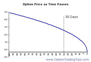
Option Price as Function of Time to Expiration, From http://www.optiontradingtips.com
There are other risk measures to keep in mind when trading options, known as The Greeks. Two important Greeks to understand, besides Theta, are Delta and Gamma. Delta is a measure of how much the option price changes in response to a change in the underlying. Gamma represents Delta’s rate of change, that is, how much the rate of change of the option price changes with movements in the underlying. A detailed look at Greeks is beyond the scope of this blog, but it is important to understand how these metrics affect your profit and loss potential. Check these resources to learn more: ThinkorSwim, Investopedia, and The Options Guide.
There’s some really interesting strategies one can employ when trading options. Many are described at The Options Guide. You can buy (and sell! – but I won’t go into selling options on this post) both Calls and Puts at varying strike prices and at varying expiration dates lending to some pretty complex trading schemes.
Ok, so great, that’s all well and good, but how do you trade them? Simple. Pattern recognition.
As you may have noticed in my previous blog posts, I like to do a lot of technical analysis. Technical analysis might be a dying art, but it helps to try to pick bottoms and tops and predict swings. It’s pretty remarkable to me how faithfully stocks can follow trendlines and areas of support and resistance, so I try to use the general trends as guidelines for when to enter and exit. This leads to a lot of tape-watching for the right entry or exit point.
My golden rule is fundamentals tell you what to invest in, technicals tell you when to invest. For instance, if I notice a stock that has attractive financials (or unattractive, for the bearish traders) has bounced nicely off a trendline, there’s a good chance that will be the bottom (or top) and I’ll buy calls (or puts) accordingly. If I’m almost certain of a price move, I’ll load up on near term OTM/ATM options, which could be an insanely foolish strategy because of the high Theta, but sometimes most lucrative due to the high Gamma, and therefore highest percentage increase in stock option price (relative to other ITM or deep OTM options).
I like real-life examples, instead of made-up scenarios, so here’s one. A few months ago, I bought 60 AAPL call options for $18.15 with a strike price of $570. With commission, it cost me $109,024. When I bought it, AAPL the stock was trading around $568. When I sold the 60 options the following day, Apple made a move up to $583. I sold the 60 options for $29.50, now worth $176,875. A 60% increase. I’ll take those returns any day. Ok, so I left some profits on the table because after I sold my options, AAPL continued to go up and closed the day at $589. Those April 570 calls were now worth $37.00. I missed out on $45,000 of profits because I sold too early!! But who knows, maybe AAPL could have completely crashed (just look at Feb 15th… aapl rose from 500 to 526 then crashed down to 499).
But this represents my strategy when trading options. I’d much prefer to take profits than to risk my options being worth nothing if the stock drops or decays into nothingness.
Let’s look at another example.

AAPL Daily, freestockcharts.com

AAPL Hourly, freestockcharts.com

S&P 500 Daily, freestockcharts.com

S&P Hourly, freestockcharts.com
AAPL has been, for the most part, stuck in a medium-term descending trading channel since the highs in September. The broad S&P 500 index has also been trending downwards in the medium term, despite a long-term uptrend, due to austerity crisis concerns. The bears certainly have control and both are hitting levels of resistance. However, I believe they will breakout if and when a deal is reached in Washington.
On Dec. 19th, both the broader markets and AAPL were approaching levels of resistance. Betting on the fact that we would not see a deal come out of Washington by week’s end, I bought 1000 AAPL 525 Puts expiring Dec. 21st priced at $3.75. Subtracting commissions, the value of the puts I purchased was around $375,000.

AAPL 525 Put Opened 5/19
On the morning of Friday, Dec. 21st, AAPL stock dropped to a low of $510.24. Because of this underlying price drop, the price of the OTM AAPL 525 Puts I bought for $3.75 were now worth over $12.00, because they became ITM. By 11:00 am on Dec. 21st, the value of the 1000 puts I was holding was worth over $1.2 million. That’s a pretty good gain. However, I didn’t sell the puts and chose to hold them through expiration. AAPL rebounded off a major increasing trendline and closed the day at $520.17. The puts decreased in value and expired at a price of $5.45 resulting in a total cash value of $545,000.

AAPL 525 Put Expired 12/21
Eh, should have closed out my position earlier in the day. But my overall options strategy is to initially look at the fundamentals of the macroeconomic environment and the specific company I’m trading. This tells me what to trade. I then look at the technicals to tell me when I should open and close my positions.
So I hope I’ve been able to explain options somewhat more clearly. They are a powerful financial instrument to realize huge gains, but you must understand how to properly wield them. Unlike normal stock, there is a real danger to lose your entire investment when you trade options. When you’re holding normal shares of a stock and the price drops substantially, you could lose a large portion of your investment, and there’s always a chance the stock price could rebound so you’ll recover your loses, but rarely will you lose your entire investment, which can be common when trading options.
It should be noted that all transactions described on this blog were performed on the Investopedia Stock Simulator and not in the real stock market. I have no actual positions in any stocks mentioned nor will I be initiating any actual positions in the next 6 months. Furthermore, the information on this blog should not be considered financial advice. The main purpose of the blog is to educate its readership, myself included, about concepts and ideas that were previously unknown to me.

